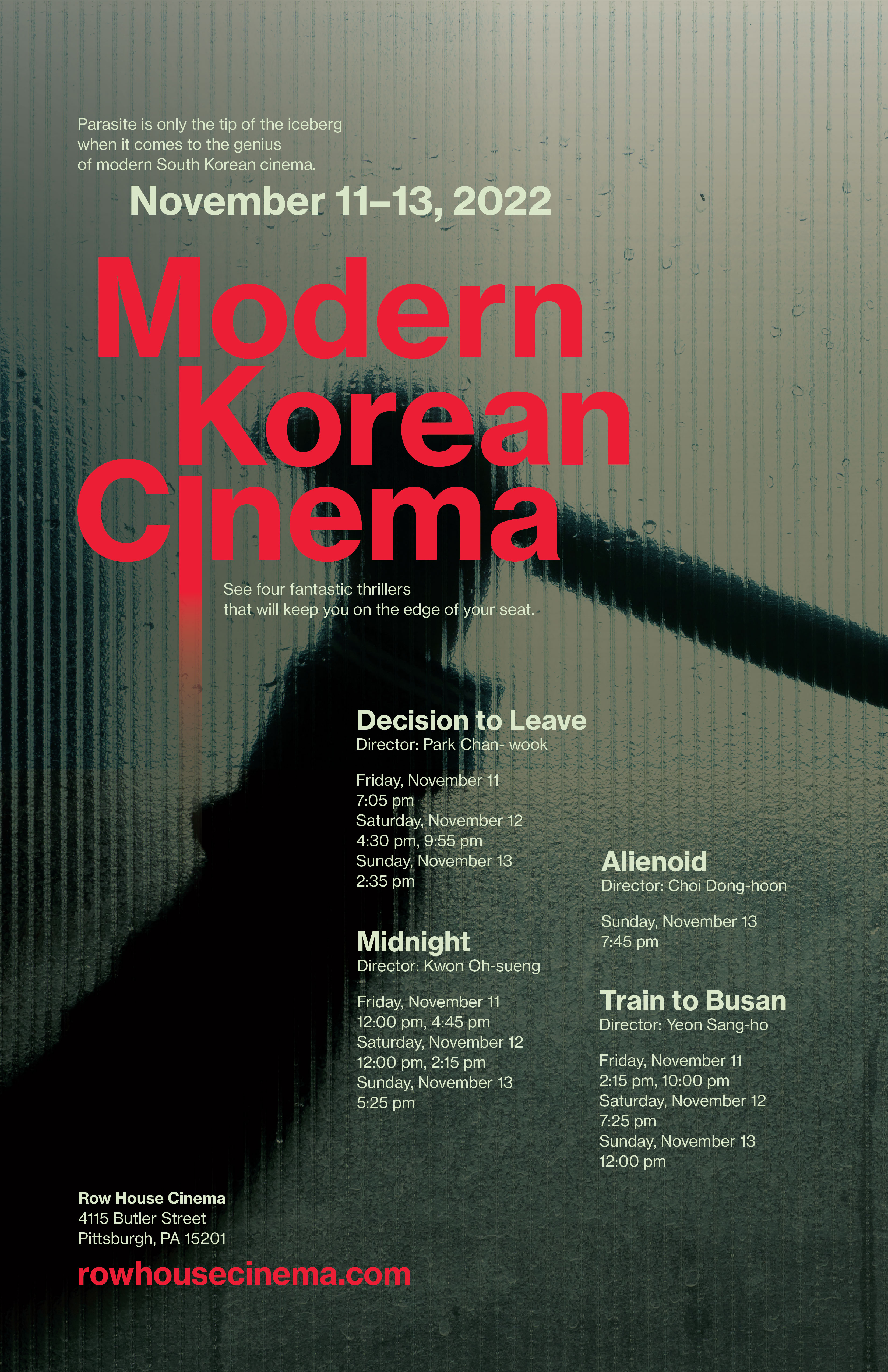
Visual Hierarchy Study: Row House Cinema Poster
A poster highlighting a local cinema’s Korean thriller movie showcase.
2 weeks
Photoshop, Illustrator
Learning about visual hierarchy with a focus on: alignment, scale, proximity, color, weight and contrast.
Context
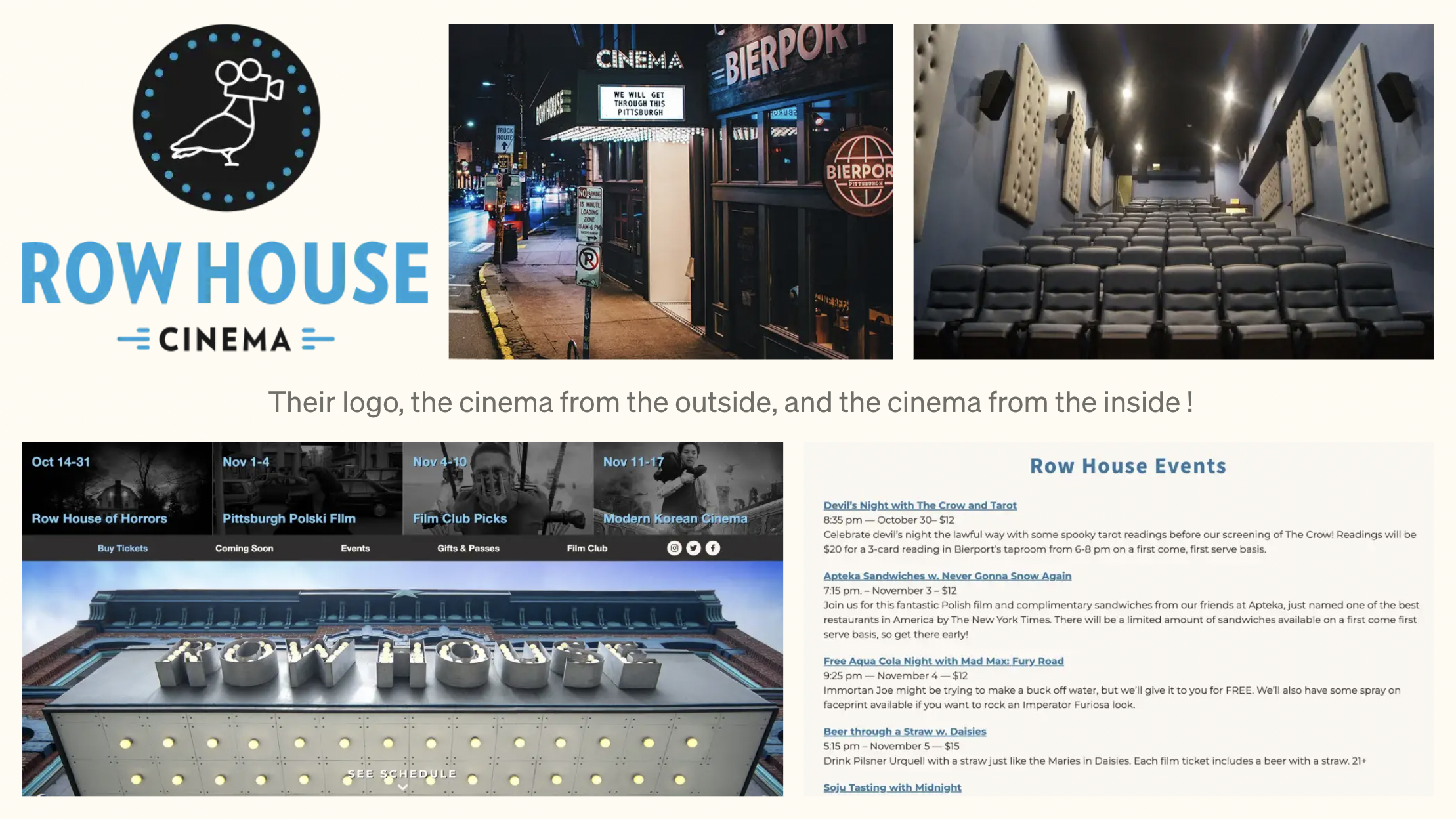
Row House Cinema is a 84-seat-single-screen theatre located in Pittsburgh’s Lawrenceville neighbourhood. They cycle through weekly themes— Modern Korean Cinema is one of these.
Row House Cinema is a 84-seat-single-screen theatre located in Pittsburgh’s Lawrenceville neighbourhood. They cycle through weekly themes— Modern Korean Cinema is one of these.
The community events the cinema hosts, and their commitment on showing “new, old, popular, weird, amazing, and obscure movies” is unique.
Who?
Connected to the Bierport bar, and featuring primarily more mature themed films, their audience consists of adults.
Why care?
The week is an introduction into Korean cinema after the spike of interest through Parasite and Squid Games.
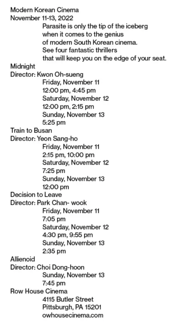
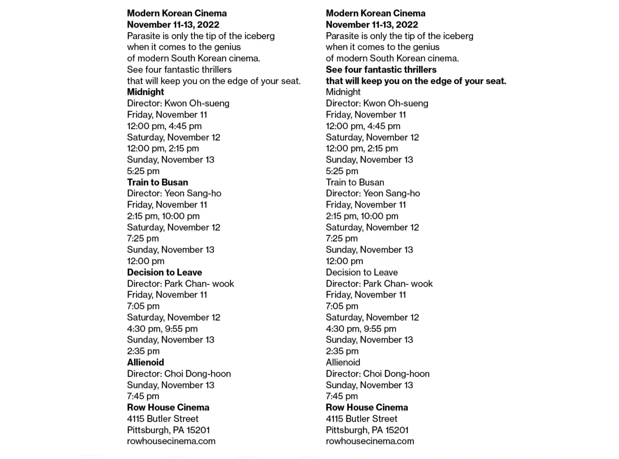
I started by developing an understanding of the information presented by the client by organizing hierarchy through contrast, weight and alignment.
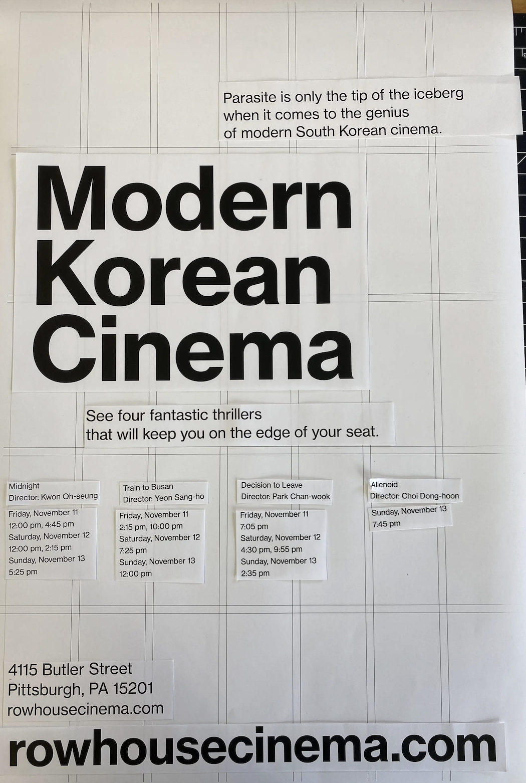
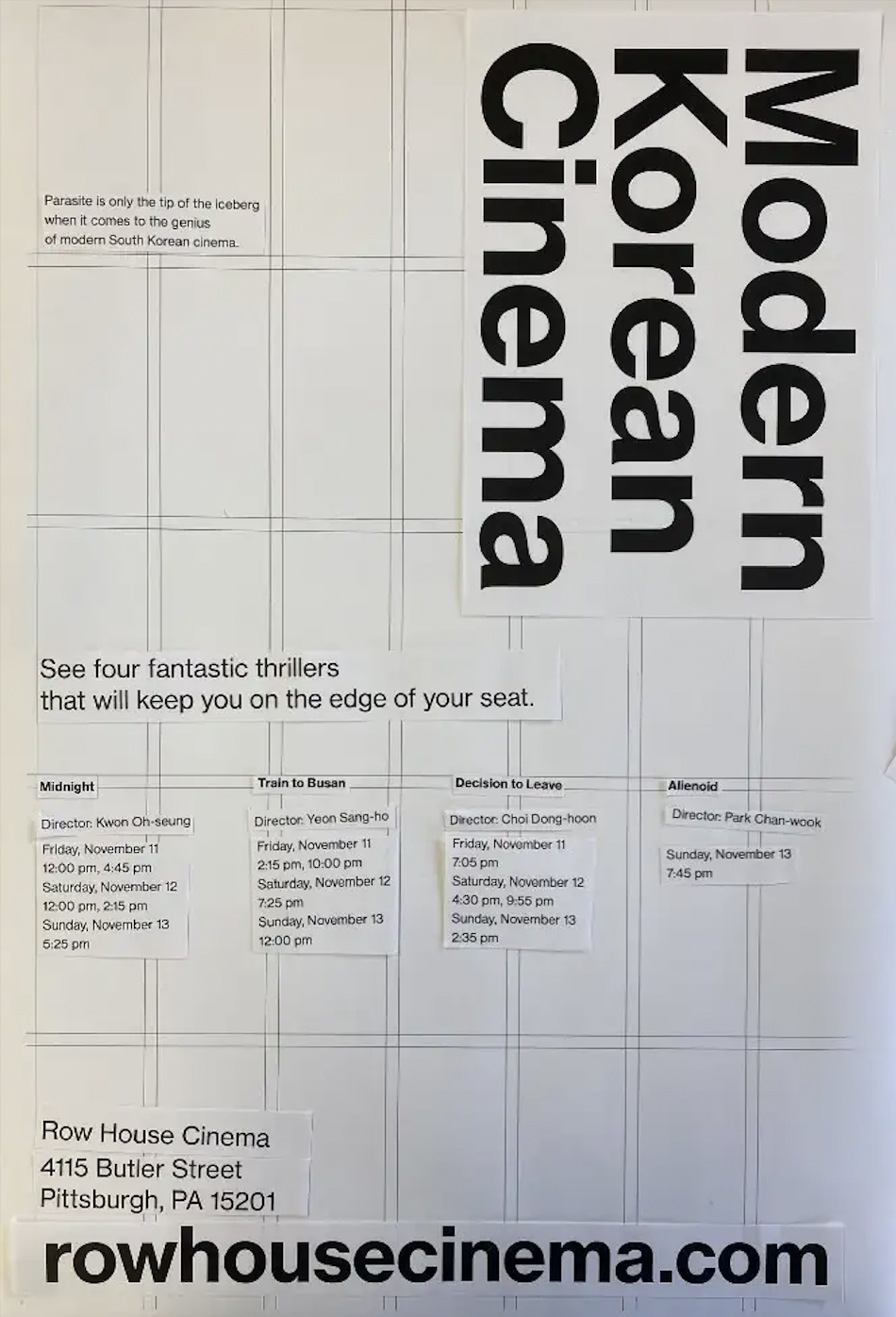
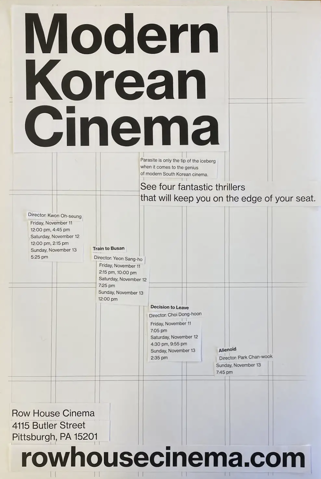

Physical Prototyping
Working with physical cutouts to quickly ideate compositions and gain an intuitive understanding of flow and organisation of the content.
Playing with scale and weights of text physically allowed me to iterate on what works better on a printed piece before jumping into software.
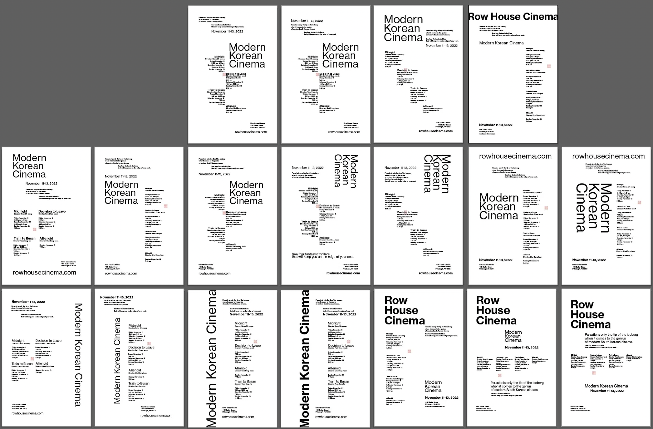
Digital Prototyping
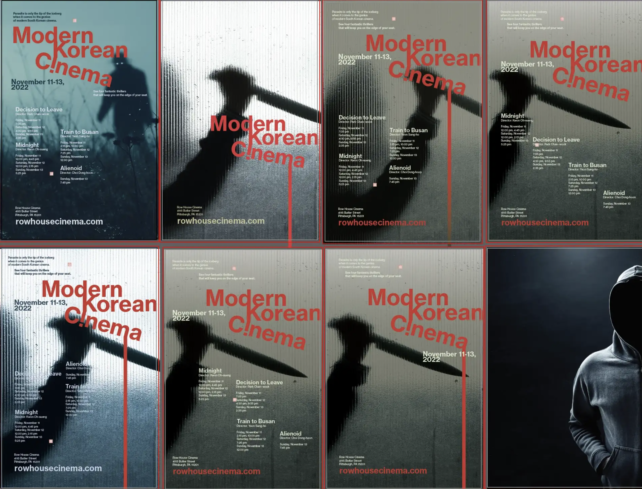
Working in Illustrator to get a bunch of ideas out. Using different grids to guide my process.
I felt it was important to have ‘Modern Korean Cinema’ be the focus of the poster. While the ‘Row House Cinema’ may capture more attention, the cinema’s goal was to promote a cultural experieces, and focusing on the cinema felt like a dishonor to this mission.
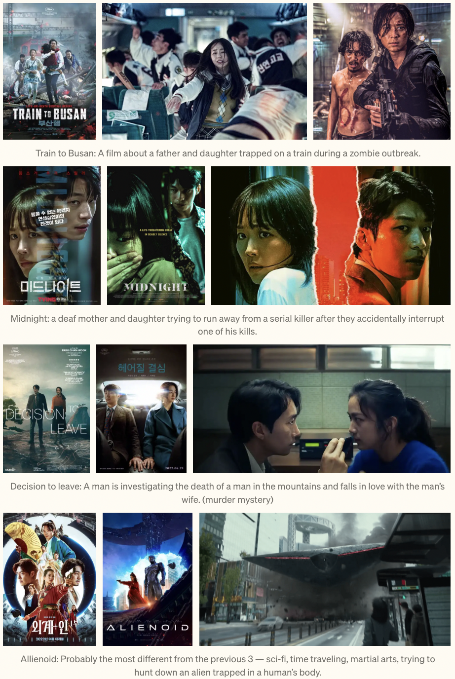
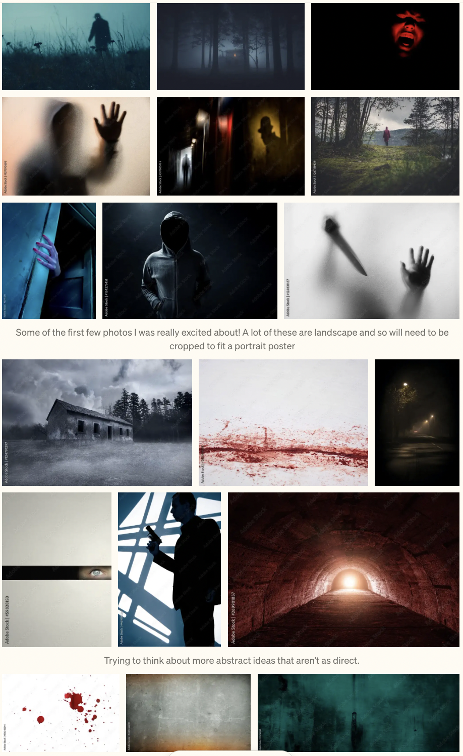
Color and Image!
Researching the films chosen for showing, I realized the use of cool, eerie blue-green tones in korean thriller/ horror films as opposed to american horror’s classic red-black palette.
The films were also based more in psychological fear as opposed to gore— I wanted to reflect this more hidden/abstract aspect in my image.
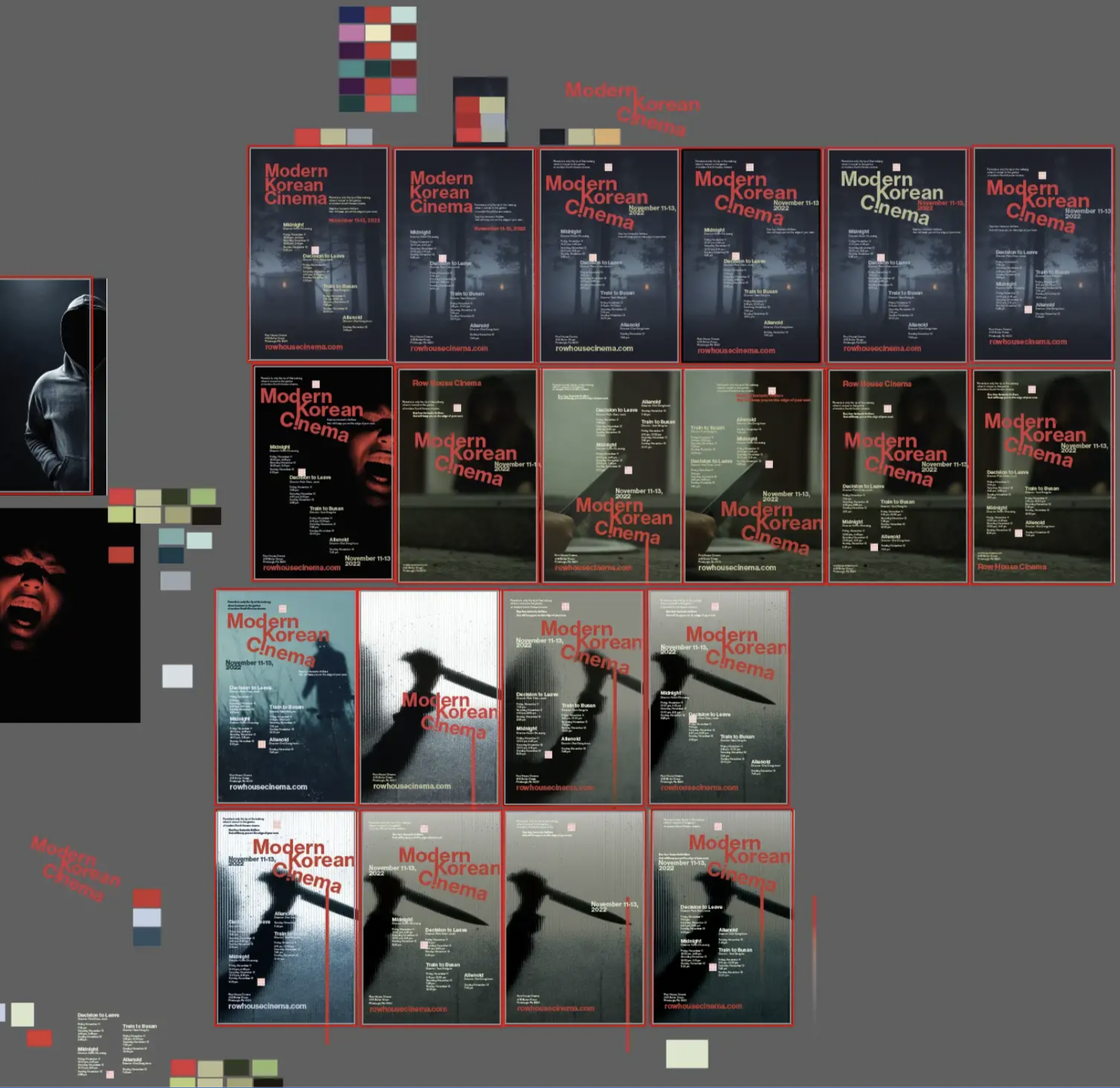

Iterating with image and finding a playful blood- dripping concept in the type.
I enjoyed the idea of a top-down flow of information guided by a drop of blood. This would be especially nice in guiding viewers through unfamiliar movie titles and director names.
